前言
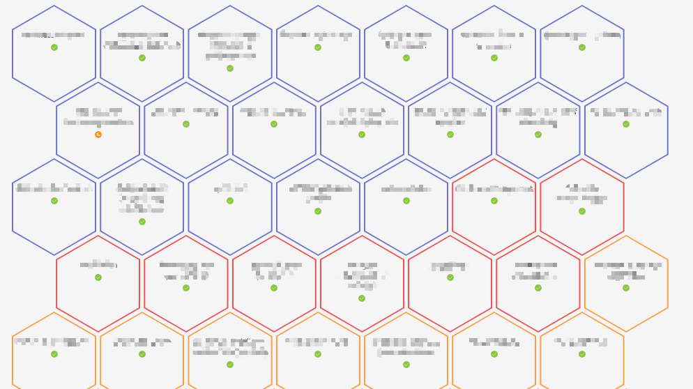
最近新上一个项目,有个页面需要实现六边形布局排列,如下图(敏感数据打了马赛克):
![8QUxuaHmG2E1keM]()
需要实现以上布局,并且能够根据屏幕宽度自动调整每行的个数;
先画一个六边形
1
2
3
| <div class="container">
<div class="hex"></div>
</div>
|
1
2
3
4
5
6
7
8
9
10
11
12
13
14
15
16
| $hexWidth: 120px;
$hexHeight: 130px;
.container{
margin: 0 auto;
font-size: 0;
width: 768px;
}
.hex {
display: inline-block;
position: relative;
width: $hexWidth;
height: $hexHeight;
background: #64c7cc;
-webkit-clip-path: polygon(0 25%,50% 0,100% 25%,100% 75%,50% 100%,0 75%);
clip-path: polygon(0 25%,50% 0,100% 25%,100% 75%,50% 100%,0 75%);
}
|
![GZEx2e6f9srKzLX]()
关于 clip-path的兼容性请参考:CSS clip-path property (for HTML)
关于clip-path的在线调试请参考: CSS clip-path maker
排列多个六边形
1
2
3
4
5
6
7
8
9
10
11
12
13
14
15
16
17
18
19
20
21
22
23
24
25
26
27
28
29
30
31
32
| <div class="container">
<div class="hex">
</div>
<div class="hex">
</div>
<div class="hex">
</div>
<div class="hex">
</div>
<div class="hex">
</div>
<div class="hex">
</div>
<div class="hex">
</div>
<div class="hex">
</div>
<div class="hex">
</div>
<div class="hex">
</div>
<div class="hex">
</div>
<div class="hex">
</div>
<div class="hex">
</div>
<div class="hex">
</div>
<div class="hex">
</div>
</div>
|
![2Ec9aYIAsV4Q5ep]()
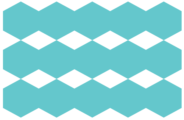
增加间隙
1
2
3
4
5
6
7
8
9
10
11
12
13
14
15
16
17
18
| $hexWidth: 120px;
$hexHeight: 130px;
$gapWidth: 10px;
.container{
margin: 0 auto;
font-size: 0;
width: 768px;
}
.hex {
display: inline-block;
position: relative;
width: $hexWidth;
height: $hexHeight;
margin-left: $gapWidth;
background: #64c7cc;
-webkit-clip-path: polygon(0 25%,50% 0,100% 25%,100% 75%,50% 100%,0 75%);
clip-path: polygon(0 25%,50% 0,100% 25%,100% 75%,50% 100%,0 75%);
}
|
![L8vNo9AWs2pgYG7]()
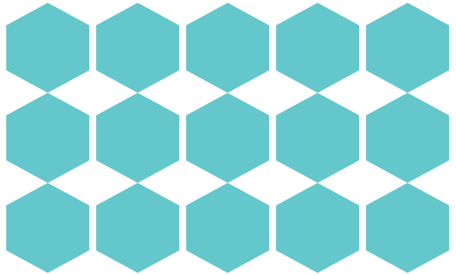
让偶数行偏移
1
2
3
4
5
6
7
8
9
10
11
12
13
14
15
16
17
18
19
20
21
22
23
| $hexWidth: 120px;
$hexHeight: 130px;
$gapWidth: 10px;
.container{
margin: 0 auto;
font-size: 0;
width: 768px;
}
.hex:nth-child(10n + 6){
margin-left: ($hexWidth / 2) + ( $gapWidth / 2) + $gapWidth;
}
.hex {
display: inline-block;
position: relative;
width: $hexWidth;
height: $hexHeight;
margin-left: $gapWidth;
background: #64c7cc;
-webkit-clip-path: polygon(0 25%,50% 0,100% 25%,100% 75%,50% 100%,0 75%);
clip-path: polygon(0 25%,50% 0,100% 25%,100% 75%,50% 100%,0 75%);
}
|
![jICfglGZ7pvJnUt]()
调整行间距
1
2
3
4
5
6
7
8
9
10
11
12
13
14
15
16
17
18
19
20
21
22
23
| $hexWidth: 120px;
$hexHeight: 130px;
$gapWidth: 10px;
.container{
margin: 0 auto;
font-size: 0;
width: 768px;
}
.hex:nth-child(10n + 6){
margin-left: ($hexWidth / 2) + ( $gapWidth / 2) + $gapWidth;
}
.hex {
display: inline-block;
position: relative;
width: $hexWidth;
height: $hexHeight;
margin-left: $gapWidth;
margin-bottom: -$hexHeight / 4 + $gapWidth;
background: #64c7cc;
-webkit-clip-path: polygon(0 25%,50% 0,100% 25%,100% 75%,50% 100%,0 75%);
clip-path: polygon(0 25%,50% 0,100% 25%,100% 75%,50% 100%,0 75%);
}
|
![U3nq9XNcCADzGIu]()
实现边框
1
2
3
4
5
6
7
8
9
10
11
12
13
14
15
16
17
18
19
20
21
22
23
24
25
26
27
28
29
30
31
32
33
34
35
| $hexWidth: 120px;
$hexHeight: 130px;
$gapWidth: 10px;
.container{
margin: 0 auto;
font-size: 0;
width: 768px;
}
.hex:nth-child(10n + 6){
margin-left: ($hexWidth / 2) + ( $gapWidth / 2) + $gapWidth;
}
.hex {
display: inline-block;
position: relative;
width: $hexWidth;
height: $hexHeight;
margin-left: $gapWidth;
margin-bottom: -$hexHeight / 4 + $gapWidth;
background: #64c7cc;
}
.hex::before {
content: "";
background-color: #fff;
left: 2px;
top: 2px;
right: 2px;
bottom: 2px;
position: absolute;
z-index: -1;
}
.hex, .hex::before {
-webkit-clip-path: polygon(0 25%,50% 0,100% 25%,100% 75%,50% 100%,0 75%);
clip-path: polygon(0 25%,50% 0,100% 25%,100% 75%,50% 100%,0 75%);
}
|
![FkSf5EKXPqzRD4H]()
填字
1
2
3
4
5
6
7
8
9
10
11
12
13
14
15
16
17
18
19
20
21
22
23
24
25
26
27
28
29
30
31
32
33
34
35
36
37
38
39
40
41
42
43
44
45
46
47
48
49
50
51
52
53
54
55
56
57
58
59
60
61
62
63
64
65
66
67
68
69
70
71
72
73
74
75
76
77
78
79
80
81
82
83
84
85
86
87
88
89
90
91
92
93
94
95
96
97
98
99
100
101
102
| <div class="container">
<div class="hex">
<div class="hex-body">
TEST1
</div>
</div>
<div class="hex">
<div class="hex-body">
TEST2
</div>
</div>
<div class="hex">
<div class="hex-body">
TEST3
</div>
</div>
<div class="hex">
<div class="hex-body">
TEST4
</div>
</div>
<div class="hex">
<div class="hex-body">
TEST
</div>
</div>
<div class="hex">
<div class="hex-body">
TEST
</div>
</div>
<div class="hex">
<div class="hex-body">
TEST5
</div>
</div>
<div class="hex">
<div class="hex-body">
TEST6
</div>
</div>
<div class="hex">
<div class="hex-body">
TEST7
</div>
</div>
<div class="hex">
<div class="hex-body">
TEST8
</div>
</div>
<div class="hex">
<div class="hex-body">
TEST9
</div>
</div>
<div class="hex">
<div class="hex-body">
TEST10
</div>
</div>
<div class="hex">
<div class="hex-body">
TEST11
</div>
</div>
<div class="hex">
<div class="hex-body">
TEST12
</div>
</div>
<div class="hex">
<div class="hex-body">
TEST13
</div>
</div>
<div class="hex">
<div class="hex-body">
TEST14
</div>
</div>
<div class="hex">
<div class="hex-body">
TEST15
</div>
</div>
<div class="hex">
<div class="hex-body">
TEST16
</div>
</div>
<div class="hex">
<div class="hex-body">
TEST17
</div>
</div>
<div class="hex">
<div class="hex-body">
TEST18
</div>
</div>
</div>
|
1
2
3
4
5
6
7
8
9
10
| .hex-body {
height: $hexHeight / 2;
width: 100%;
position: absolute;
left: 0;
top: 50%;
transform: translateY(-50%);
font-size: 16px;
text-align: center;
}
|
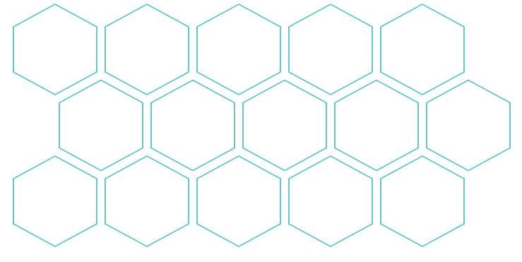
![JEwiRK.png]()
响应式调整
这边使用 CSS3 的 Media queries 来进行适配,定义几个断点,我们参考Bootstrap的定义:
- Extra small:< 576px
- Small: ≥576px
- Medium: ≥768px
- Large: ≥992px
- Extra large: ≥1200px
1
2
3
4
5
6
7
8
9
10
11
12
13
14
15
16
17
18
19
20
21
22
23
24
25
26
27
28
29
30
31
32
33
34
35
36
37
38
39
40
41
42
43
44
45
46
47
48
49
50
51
52
53
54
55
56
57
58
59
60
61
62
63
64
65
66
67
68
69
70
71
72
73
| .container{
margin: 0 auto;
font-size: 0;
}
@media only screen and (min-width : 1200px) {
.container{
width: 1140px;
}
.hex:nth-child(16n + 9){
margin-left: ($hexWidth / 2) + ( $gapWidth / 2) + $gapWidth;
}
}
@media only screen and (min-width : 992px) and (max-width: 1200px) {
.container{
width: 900px;
}
.hex:nth-child(12n + 7){
margin-left: ($hexWidth / 2) + ( $gapWidth / 2) + $gapWidth;
}
}
@media only screen and (min-width : 768px) and (max-width: 992px) {
.container{
width: 720px;
}
.hex:nth-child(10n + 6){
margin-left: ($hexWidth / 2) + ( $gapWidth / 2) + $gapWidth;
}
}
@media only screen and (min-width : 576px) and (max-width: 768px) {
.container{
width: 520px;
}
.hex:nth-child(6n + 4){
margin-left: ($hexWidth / 2) + ( $gapWidth / 2) + $gapWidth;
}
}
@media only screen and (max-width: 575px) {
.container{
width: 360px;
}
.hex:nth-child(4n + 3){
margin-left: ($hexWidth / 2) + ( $gapWidth / 2) + $gapWidth;
}
}
|
![JEwKit.png]()
![JEwlz8.png]()
![JEwYZj.png]()
![JEwdJ0.png]()
![JEwcw9.png]()
CodePen 链接
See the Pen
css-hexagon-layout-item by shmy (@shmy)
on CodePen.